Summary
"Debit that builds credit"
Role: Product Designer
Duration: Sept - Nov 22 (2 months)
Accountable KPIs: Daily Active Users, Retention, Churn, LTV, Member stickiness
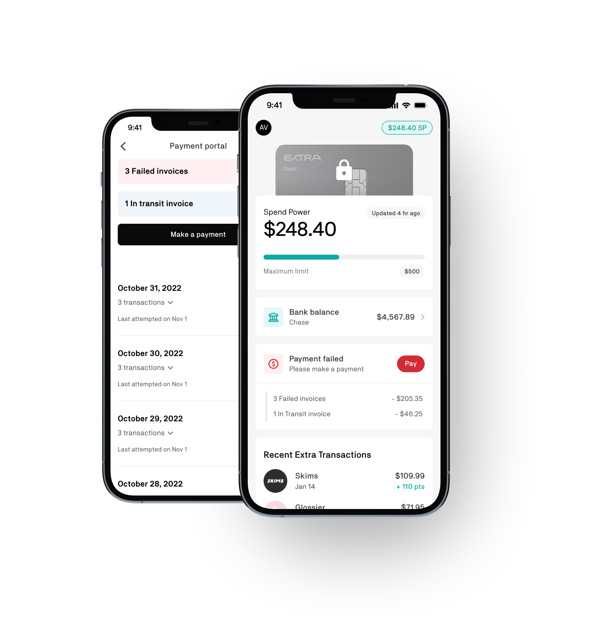
About: Extra is a debit card that helps build credit. In September 2023, we launched the Experience tab with the expectation of boosting engagement. However, the KPIs showed that the Experience tab was underperforming, so we delved into micro-learning opportunities to enhance engagement.
New Design
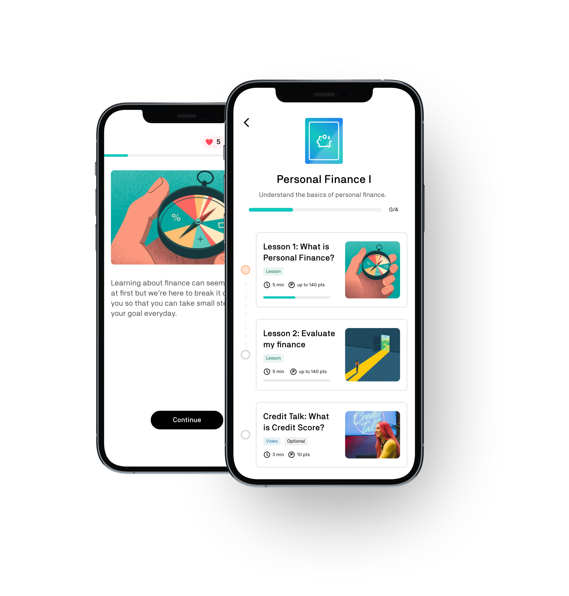
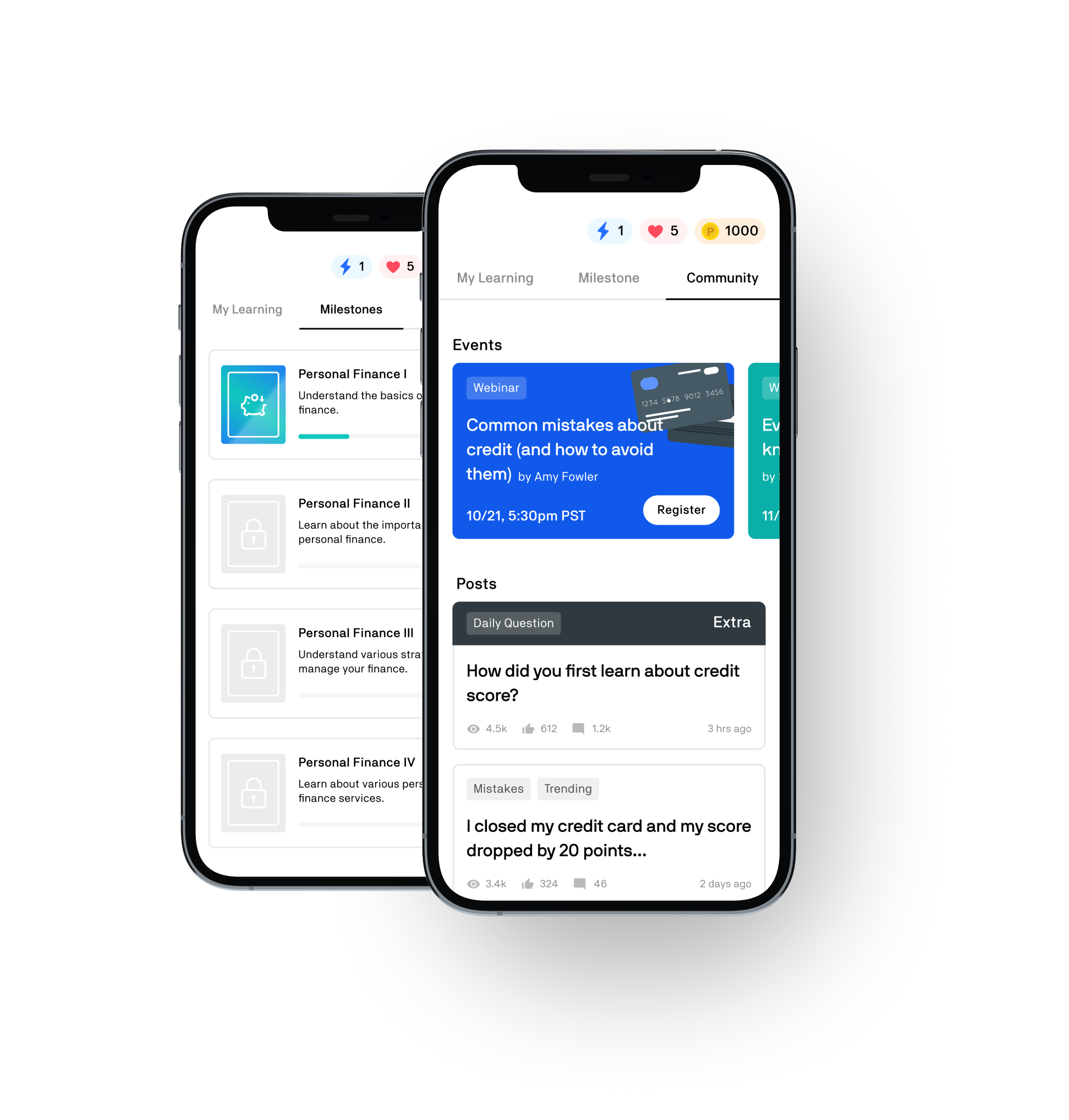
The Learn Tab offers a customized learning experience to help users improve their personal finance skills.
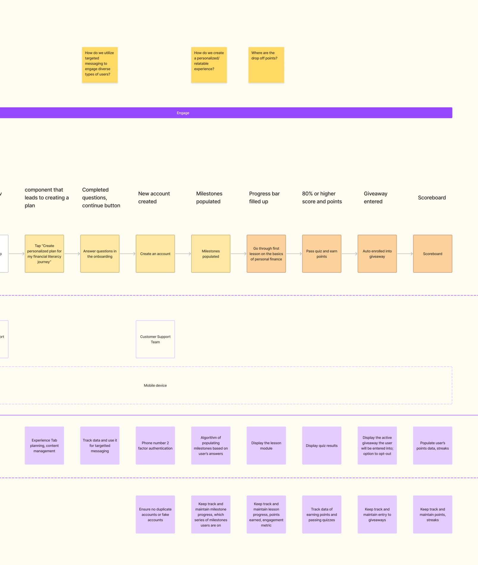
The onboarding process within the app helps users build a personalized curriculum tailored to their needs, preferences, and financial goals. Once completed, the app generates milestones that include lessons, quizzes, articles, and videos.
Problem
Solution
Problem #1
Users feel overwhelmed with the amount of information they need to learn and are unsure where to begin.
Company needs to enhance upselling techniques to increase sales revenue and customer retention.

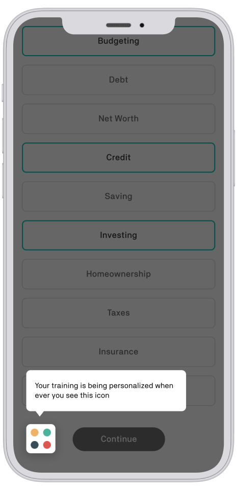
Consistently deliver personalized content by frequently interacting with users and understanding their interests and needs.
Problem #2
Users have a hard time learning consistently & retaining information long-term.
Company needs to improve daily engagement and retention rates to ensure customer loyalty and sustain business growth.

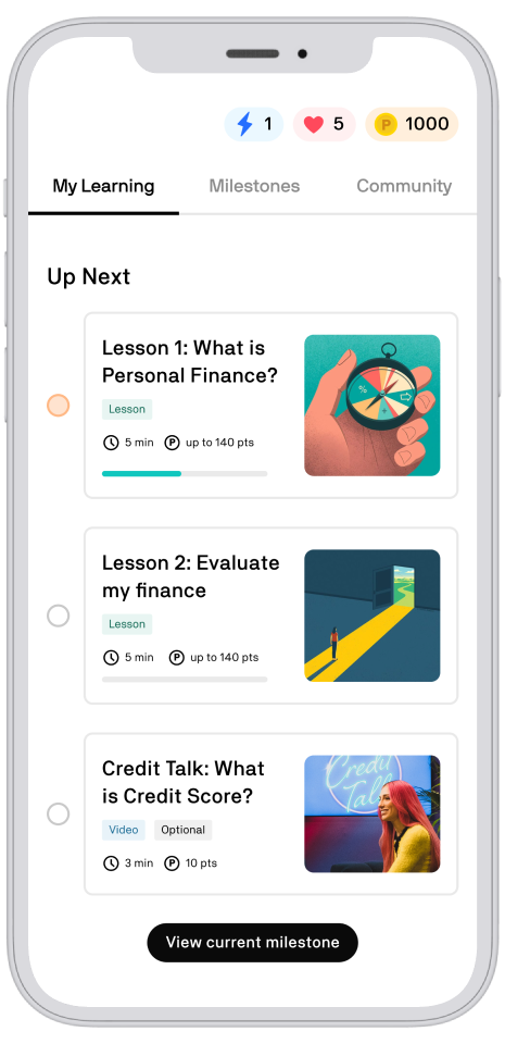
Micro-lessons to cultivate daily habits and improve information retention.
Problem #3
Users lack accountability & motivation.
Company needs to establish a system for receiving constant feedback and identifying issues early to ensure timely resolution.

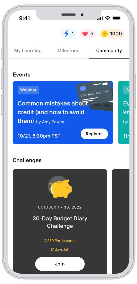
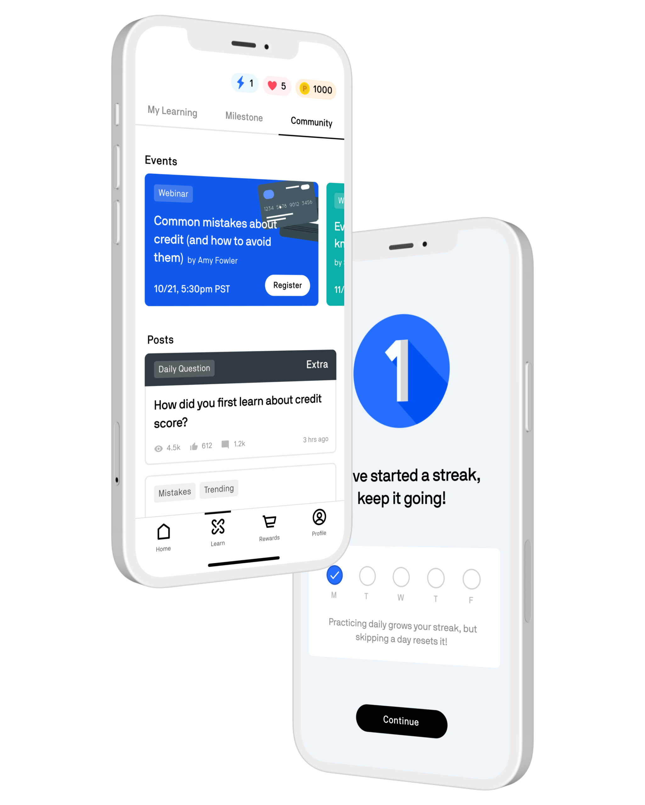
In-app community to engage users with each other and the brand.
Process
Problems of Old Design
The Experience Tab incentivized users to participate in giveaways for an opportunity to win something.
- User needs were not clearly defined and resolved.
- Usability test revealed that users were feeling skeptical and disinterested in the tab.
- Video content can be easily found online.
KPIs
Data revealed that Experience Tab has been underperforming after the launch.
15.5% ↓
Daily active users
have gone down by 15.5% since the launch of the Experience Tab
28.8% ↓
Unique users viewing
experience tab has gone down 28.8% since the launch.
51% ↓
Unique users watching
video has gone down by 51% since the launch.
78% ↓
Giveaway participation
has gone down by 78% since the launch.

Back to the users
I talked to users and found that people didn't receive formal learning on personal finance.
- People possess only a basic understanding of credit & personal finance.
- They struggle to identify errors.
- They rely on inconsistent sources of information for learning.
Secondary Research Findings
"A lack of personal finance knowledge costs an estimated avg of $1,389.06 per individual, or $352 billion total in the U.S. each year."
"Nearly half of Americans don't know how their credit score is calculated."
"Millennials make financial decisions in the normal course of everyday life from a very limited base of personal finance knowledge."
"Spouses that argue about money at least once a week are 30% more likely to get divorced."
User goal
Develop a deeper understanding of credit and personal finance in an easily digestible format to make better informed financial decisions.
Business Goal
Increase engagement in the app to provide valuable experiences that keeps users in the app ecosystem.
Opportunity
After analyzing financial education apps based on features, user interface, and target audience, I identified multiple business opportunities to fill market gaps.
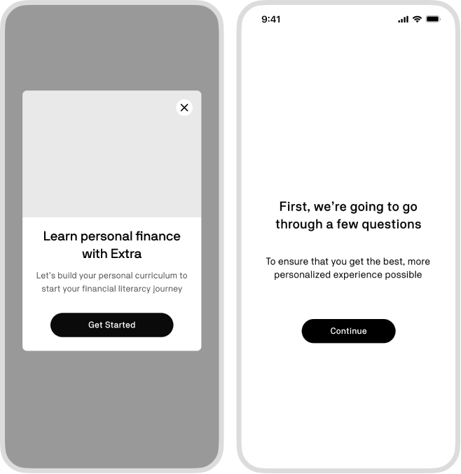
App Personalization
While many apps have successfully implemented personalization to meet the unique needs of their target audiences and strengthen brand resonance, most financial education apps still rely on a one-size-fits-all approach, offering only micro lessons that fail to deliver personalized curriculum tailored to individual users' goals and struggles.
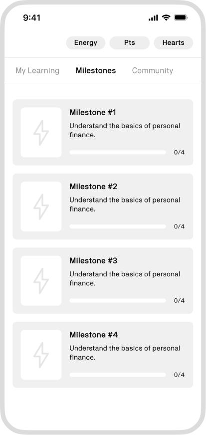
Milestones
Gamification has rapidly gained popularity as a means to engage users and help them stay focused on their goals. Milestones incorporate various gamification elements that enhance the learning experience, including setting goals, receiving feedback on progress, fostering competition, and offering rewards.
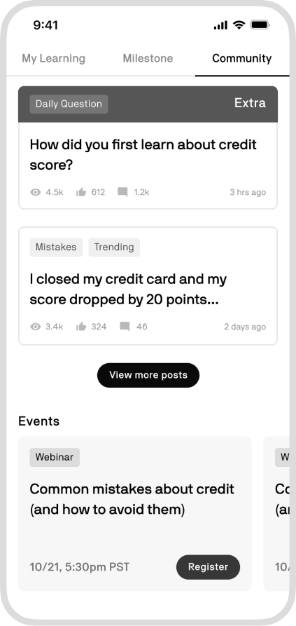
Community
Personal finance can be a sensitive topic among peers, and finding a secure environment to discuss it can be challenging. However, many financial education apps lack in-app communities, which gives us the opportunity to fill the market gap by helping users find a sense of belonging and catalyze growth from another.
Final designs
Initial personalization
Users at any level of personal finance education can start learning through personalized lesson plans.
The onboarding process is designed to identify the unique goals and challenges of each user, enabling us to create personalized lesson plans and resources tailored to their specific needs.
Continuous Personalization
User engagement within each lesson generates corresponding content on their feed and enables us to take a unique approach to upselling.
We intentionally kept the onboarding process short to reduce the drop out rate. We included 1-2 personal questions to users that are relevant to each lesson, which allows us to continually refine and personalize the curriculum based on the user's most recent answers.
Micro-learning
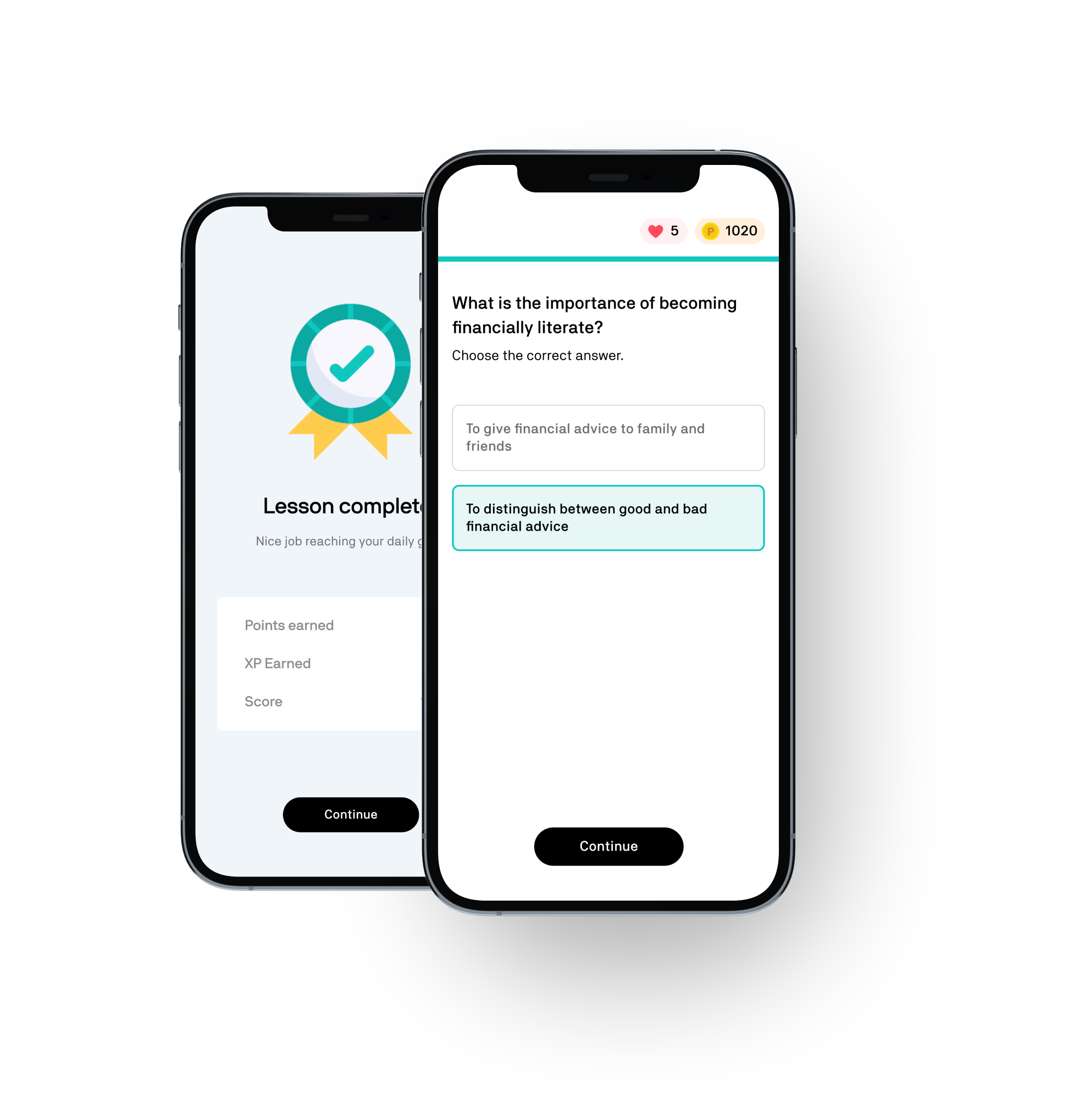
Micro-learning effectively delivers concise content while retaining important information and enhancing long-term memory.
Each milestone includes bite-sized lessons and content designed to increase in-app engagement. This approach is beneficial for users who:
• struggle to know where to start learning
• struggle with information overload
• struggle to invest a lot of time to learn
• want to retain the information they learned
In-app Community
The community creates a secure space for users to discuss finance-related topics and hold each other accountable.
From a business standpoint, we can:
• receive constant feedback on user's needs
• resolve issues early on
• use data to share valuable content at the right time
Final Thoughts
Next Steps
The team is now evaluating the next steps for this proposal. I'll closely collaborate with PMs and engineers to determine how we can utilize the proposed design as a north star to develop incremental stages that enable us to ship smaller and faster.
After launching the product, I would closely monitor metrics such as onboarding completion rate, member stickiness rate, retention rate, user satisfaction, and usability to gauge its impact.
Lessons
Conducting more user research and testing with prototypes could have helped the company save 6 months of development time. In some cases, leadership may prioritize certain features or design elements that do not align with the recommendations of product designers. As a designer, I've learned that it's important to provide alternative solutions and explain the potential benefits and risks of each option to help inform decision-making.
Product designers play a critical role in creating the best user experience for a product, but our responsibilities extend beyond simply advocating and designing for users. It's important to understand that our ultimate goal is to improve the business and it requires a deep understanding of the company's business goals and metrics to effectively visualize, strategize, and communicate the business value of specific UX improvements.
Selected Works

