Summary
Role: Product Designer
Duration: May - July 21 (3 months)
About: Apartments.com offers thousands of apartment listings but falls short in providing assistance to users during the decision-making process. As a personal project, I built a prototype based on UX research to demonstrate the proof of concept and validate the usefulness of apartment comparison features with the user base.
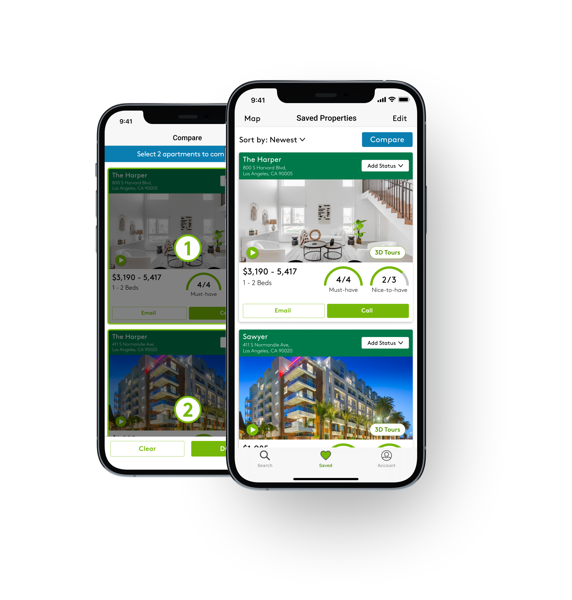
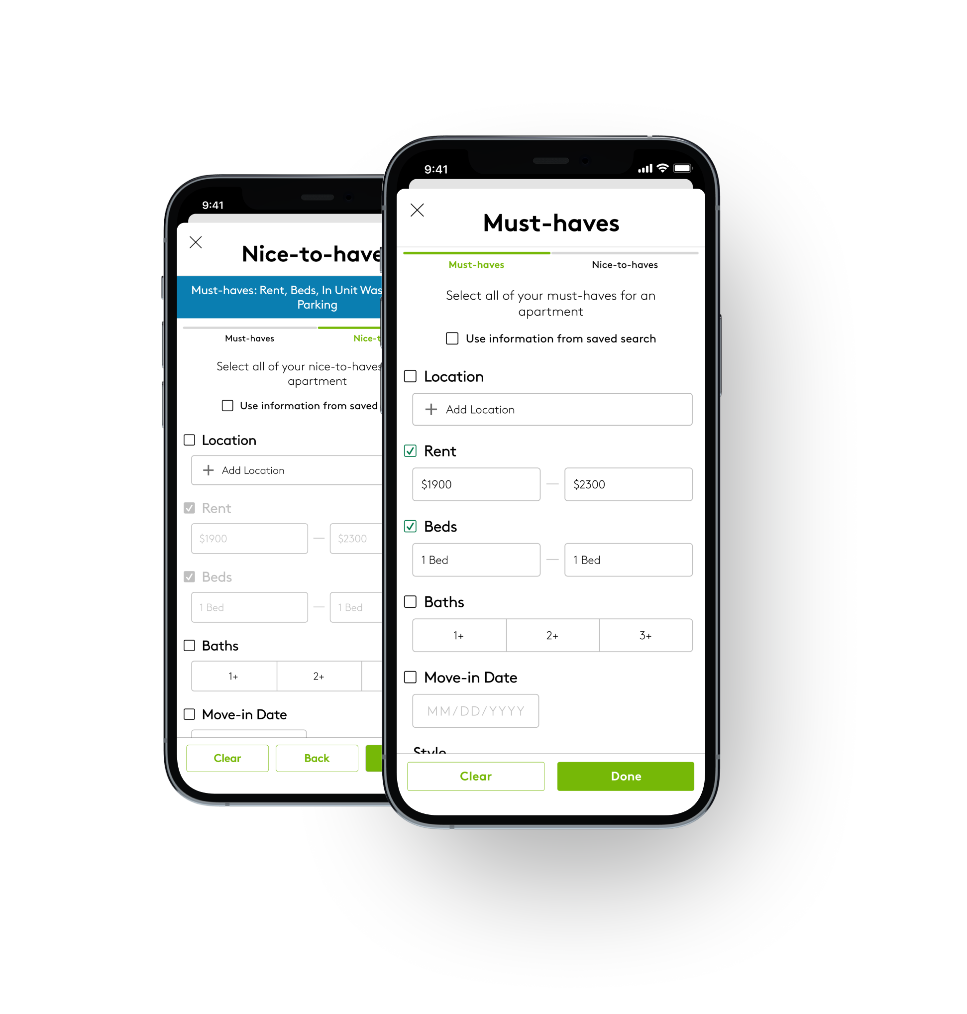
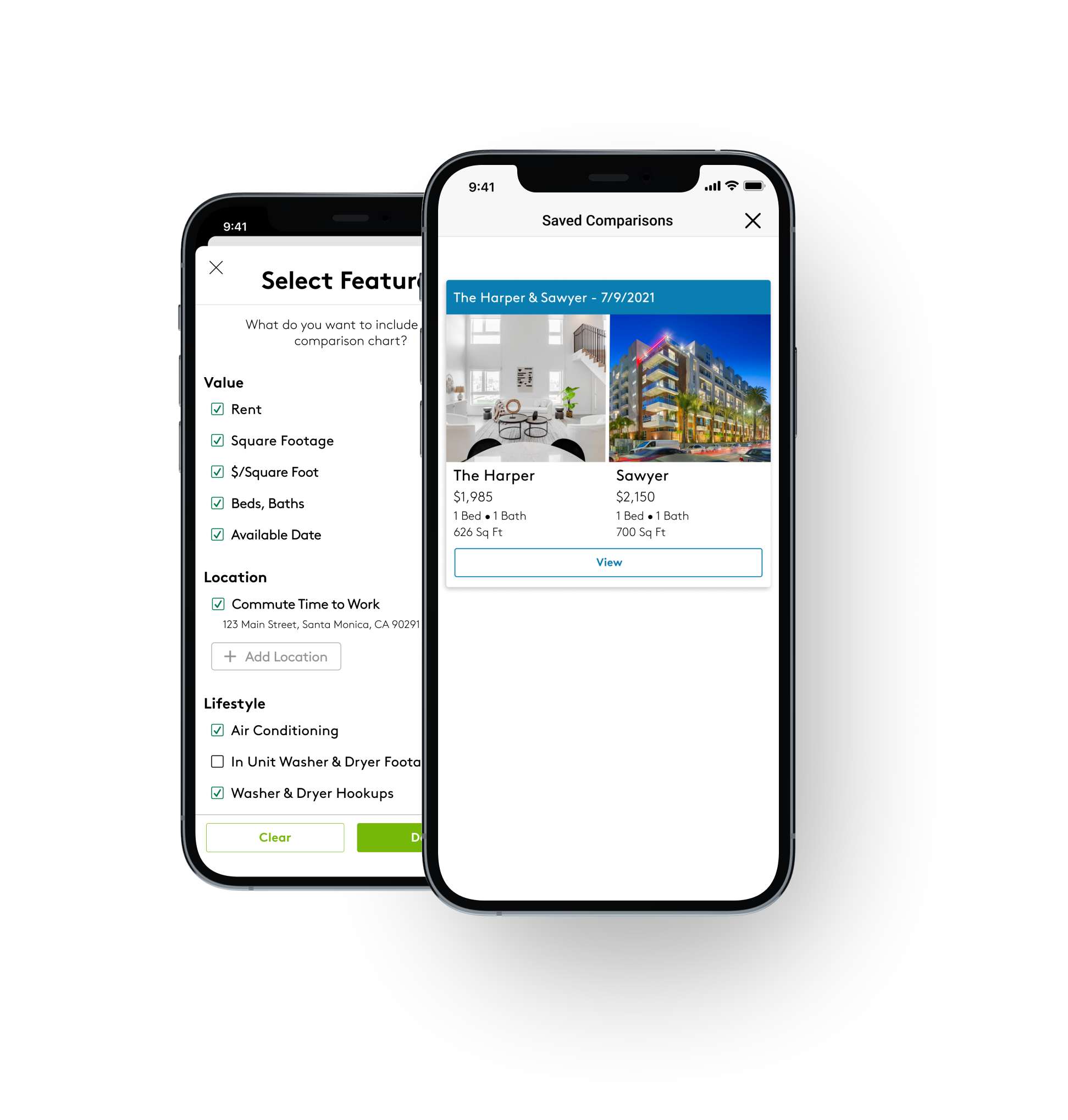
New Features
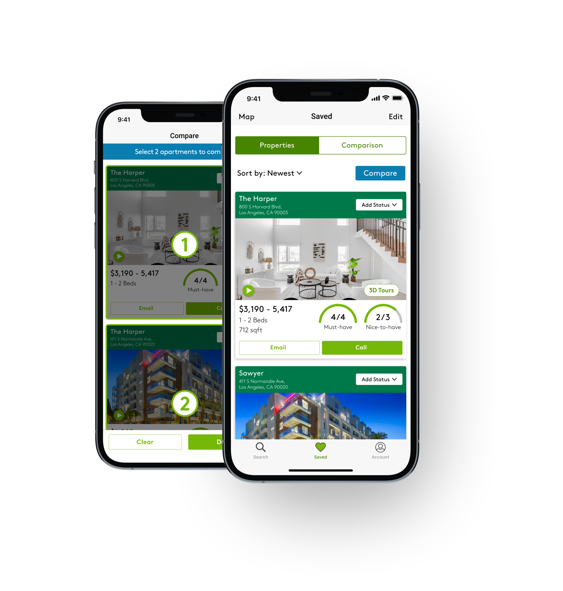
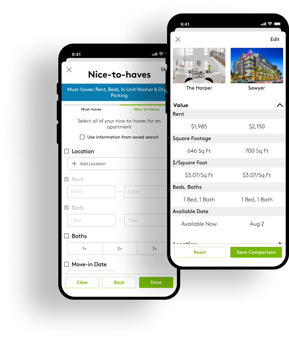
The apartment comparison tool and match rate feature help users make informed decisions and find their preferred apartment.
The comparison tool provides a side-by-side view for comparing specific attributes, and users can also add data manually to obtain a holistic comparison view based on their direct and indirect insights.
93%
Usefulness rating
93% of users found each feature to be a valuable asset in their apartment-hunting journey.
100%
Task success rate
All users were able to easily understand and utilize each feature to its full potential.
100%
Ease-of-use rating
All users found the features easy to navigate, providing a seamless and stress-free experience.
Problem
Solution
Problem #1
Users experience frustration when comparing apartments due to an overwhelming amount of information, and they are left to find their own solutions.

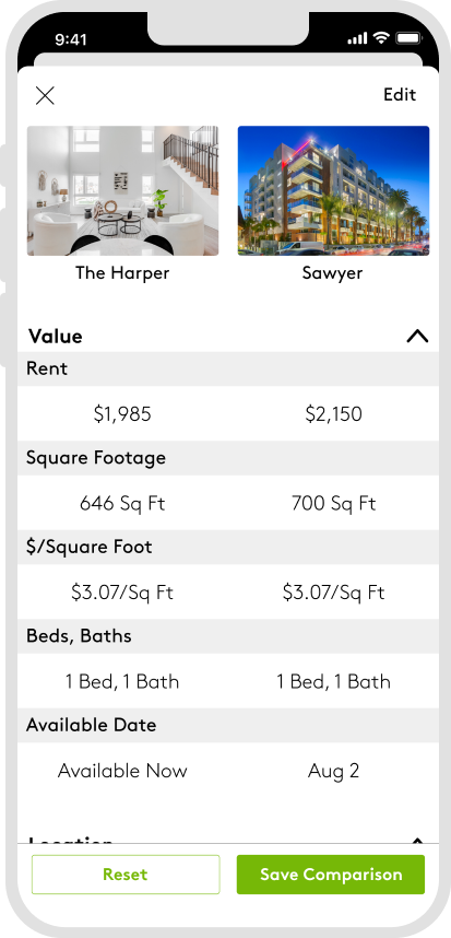
Side-by-side comparison tool to view all the important information at once.
Problem #2
Users are frustrated with the inconsistent information from each listing.

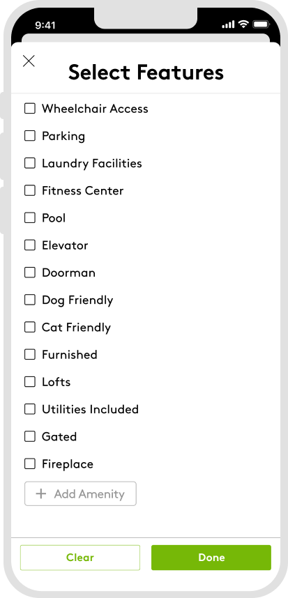
Add data manually to supplement missing information.
Problem #3
Users have a hard time processing a lot of information presented in each listing, making it challenging for them to recall the details of each one.

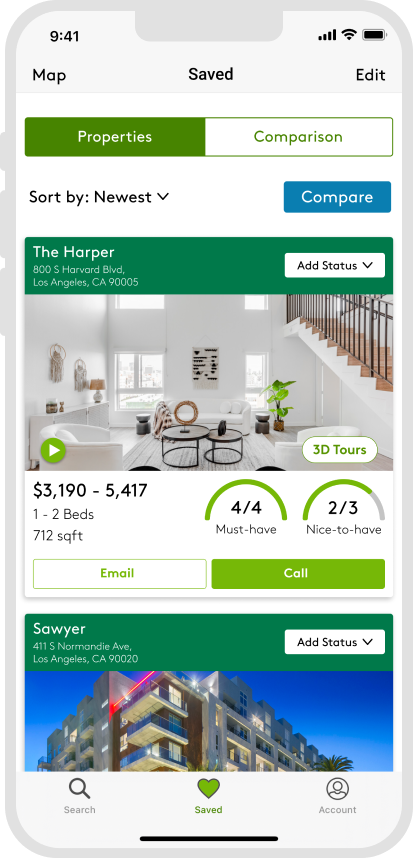
The match rate reflects the user's "must-haves" and "nice-to-haves" to find the most suitable listing.
Process
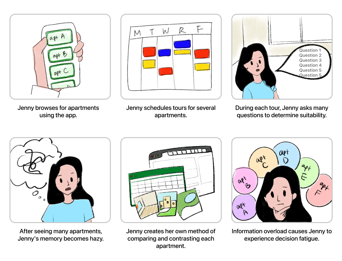
User's problem validation
Users find it challenging to narrow down and choose their preferred apartments.
- Users are forced to seek their own solutions, such as utilizing an Excel sheet or keeping multiple tabs open.
- Inconsistent information across multiple listings makes it challenging to compare & contrast.
Competitors and opportunity space
No apps offered a feature to assist users in comparing and contrasting multiple listings.
Competitor apps offered small features like adding tags and like/dislike buttons for users to leave a quick impression on each listing, but they weren't helpful when it came to narrowing down and selecting an ideal listing from a pool of multiple options.

Potential business benefit
Apartments.com can serve as a comprehensive app that assists users throughout the entire process of finding and selecting their ideal apartment.
- Increased user engagement: users who find the comparison feature useful are likely to spend more time on the app and return in the future.
- Increased conversion: a comparison feature can help users make more informed decisions about which apartment to rent that meets their needs and preferences.
- Data insights: Tracking users' apartment comparisons can help the business identify the needs and preferences of various user groups. This can be used to improve the platform, target marketing efforts effectively and develop new products and services.
User goal
Effortlessly identify and evaluate multiple apartments in the desired location and choose the one that best fits my preferences and requirements.
Feature Breakdown
Match Rate
The match rate displays a comprehensive view of how well the apartment meets the user's criteria based on their 'must-have' and 'nice-to-have' preferences. This feature can save users time and effort in their search, reducing the mental load that makes apartment hunting so stressful.
Comparison Chart
A comparison chart feature streamlines the apartment hunting process by presenting key features and amenities side-by-side, making it easier for users to assess their options quickly and make informed decisions. Additionally, users can customize their charts by selecting specific attributes to eliminate distractions and avoid irrelevant information.
Status
Users can assign specific statuses to apartment listings to stay organized, prioritize their options, and adapt to changes during the apartment search process.
Usability test insights
Success
- Users were able to anticipate the usage of the match rate, status, and comparison chart.
- Users understood how to compare two apartments.
- Users found it easy to navigate through the features.
Concerns
- Users were unsure how to edit the features on the comparison chart.
- Users were confused if data had to be entered manually for the new amenity they added.
- Users were unsure where the manually entered data on the comparison chart would be saved and how to access it later.
Iterations
I optimized some flows based on the findings from usability tests. To see the improvements, use the slider to compare the before and after versions.
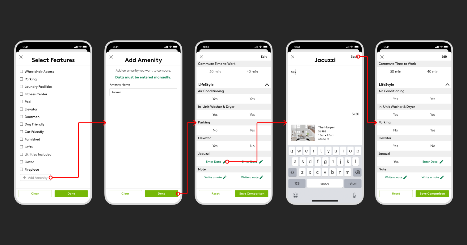
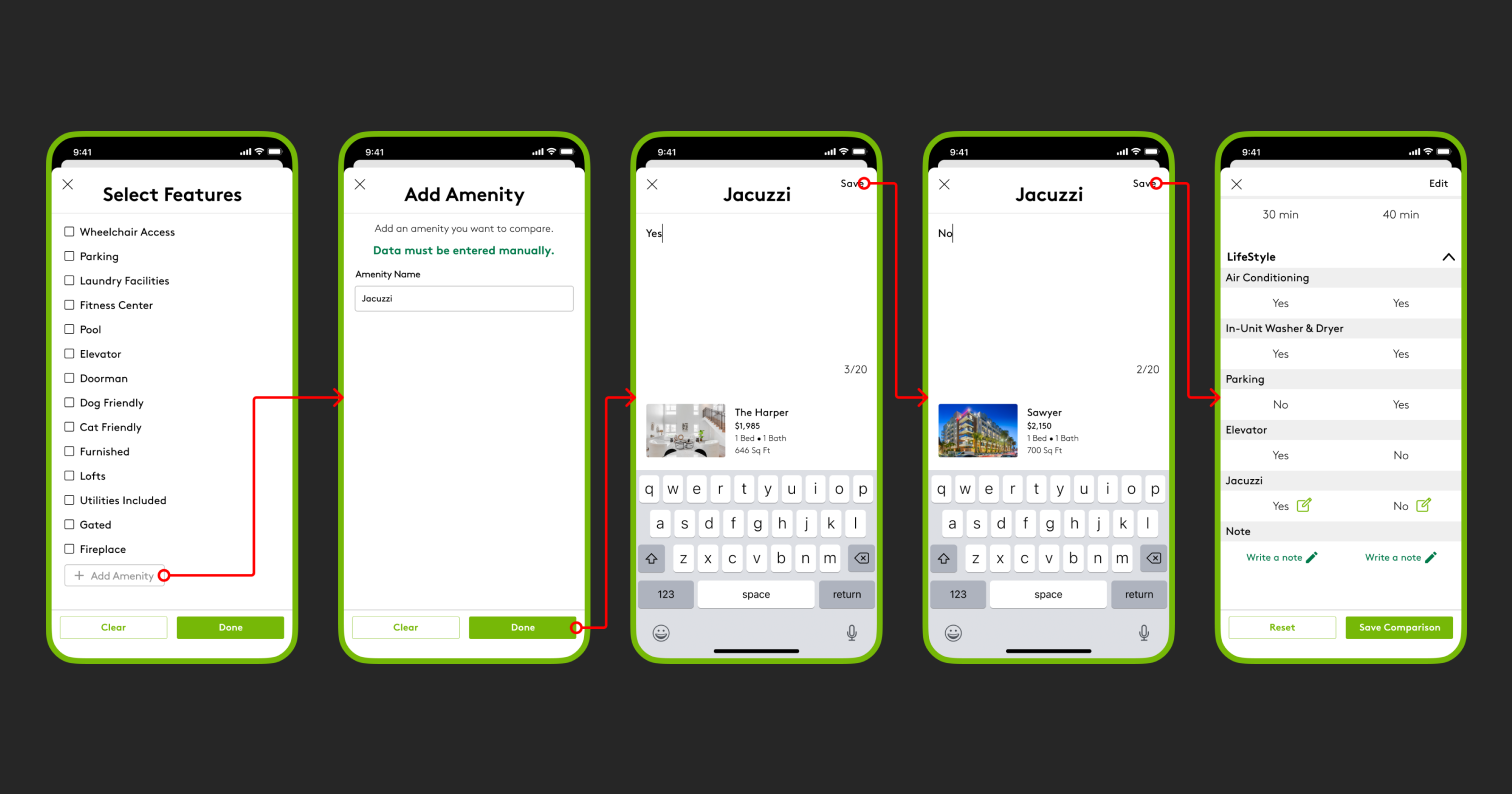
Entering data manually
Some users believed that adding an amenity would auto-populate the data. However, the purpose of this feature is to allow users to add their own information that's not available on the listings page. I learned that predictable next actions are crucial to reduce friction and improve the user experience.
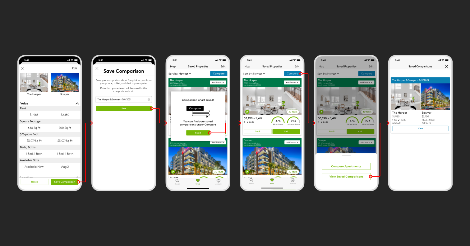
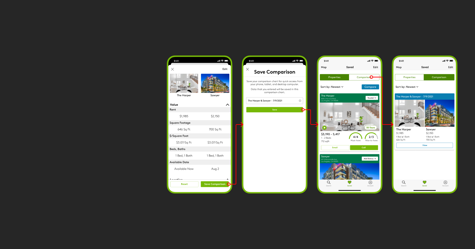
Saving the comparison chart
I reduced the number of taps it takes for users to save and access the comparison charts.
Things to consider for Data & Engineering
Metrics to track
Identify key metrics related to apartment comparisons such as the number of comparisons made, average time spent on the feature, and conversions resulting from comparisons.
Data management
Need data management capabilities, such as storing and retrieving user comparison data. We need to ensure that the data is stored securely and that it can be easily accessed and analyzed.
Scalability
Design the feature to handle high user and data volumes by making it scalable, robust, and implementing load-balancing and caching mechanisms.
Final Thoughts
Lessons
Understand the user's mental model: Users come to a product with their own expectations and mental models of how things should work. Understanding these models can help create an intuitive flow that feels natural for users as opposed to creating a learning curve.
Don't make users do the guesswork: Guide users with clear messaging and visual cues throughout the flow to help users understand what is happening and what is expected of them. Try to remove the bias as a designer and think about how people would behave using the product for the first time.
Selected Works

